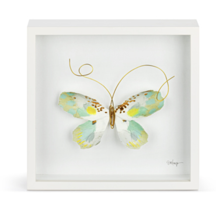
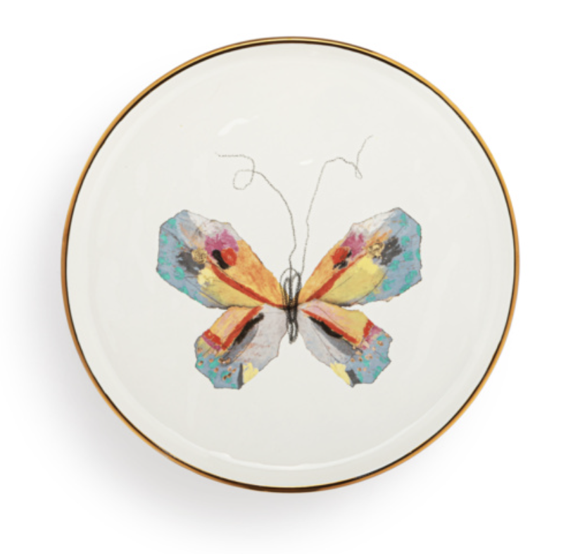
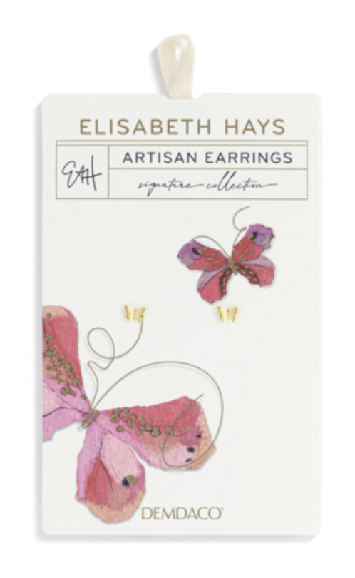
COVID has ended and the world was craving optimism. I came across mixed-media artist, Elisabth Hays. She hand assembs her watercolor butterflies in her studio in Fairhope, AL. The symbolism of butterflies - rebirth - along with her palette resonated with me as it worked perfectly with my new cycle development.
We launch a curated collection at the January gift shows. The response was immediate. Buzz from the show was terrific, and our orders exceeded our expecations. The first year sold over $1.5M and continues to see success, especially in the fashion category.
I worked with her and developed a line based on her lifestyle of “casual fancy” and DEMDACO’s top gifting single formats. The intention is never to just to mass produce their items, but build their brand with us. We bring the storytelling and creativity to take it beyond a single form and make it a larger collection.
Technically, this was a fun challenge. I worked closely with factories to represent her 3D wall art to the level of quality she appreciated and meet our cost targets. Our ceramic manufacturers and decal specialists met multiple times to reproduct the colors with the same intensity of her work. (Those in the industry know the challenge of a pink glaze paired with the temperment of a metallics!) I was able to build the collection within our margin and more importantly, I proudly display in my own home.
© Elisabeth Hays for DEMDACO
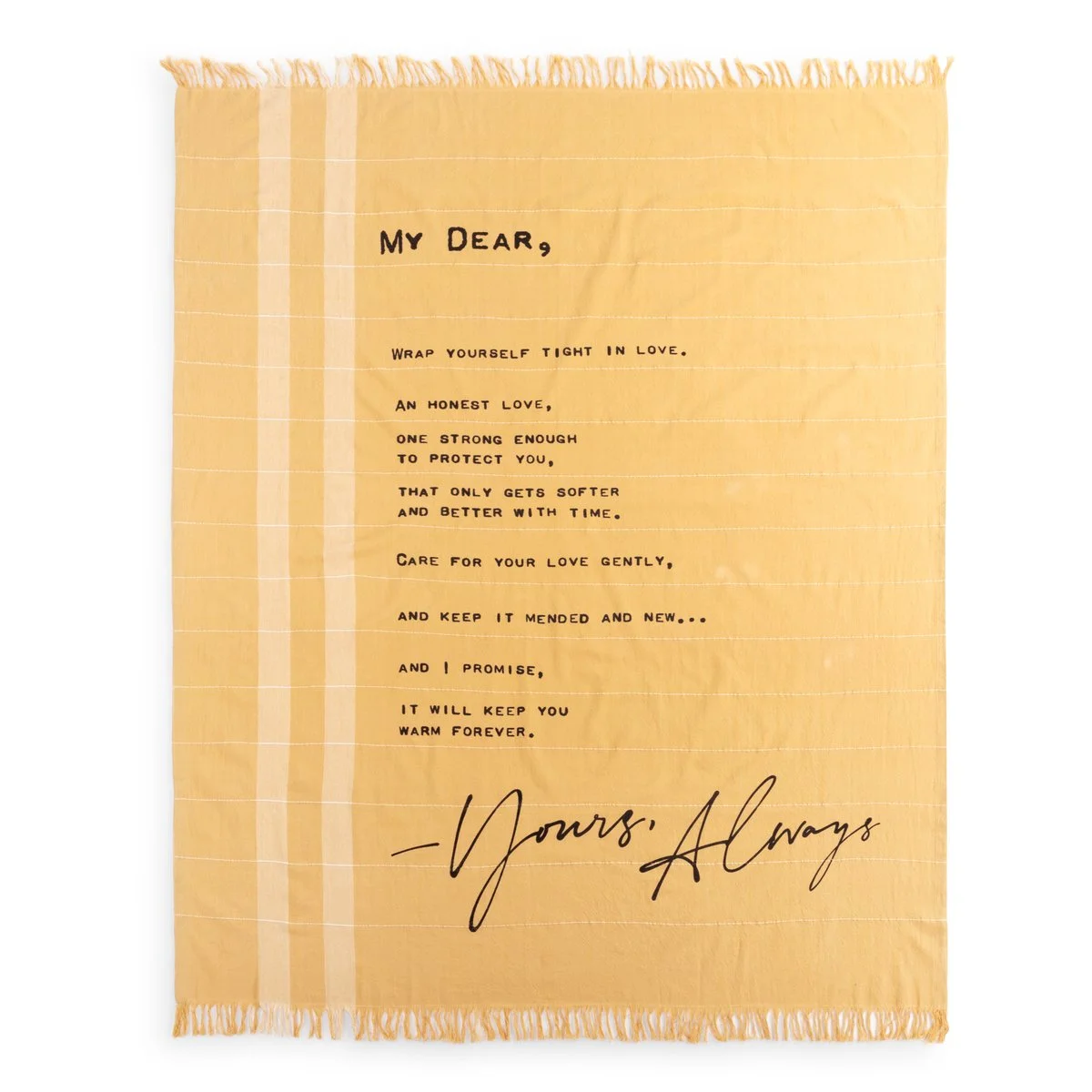
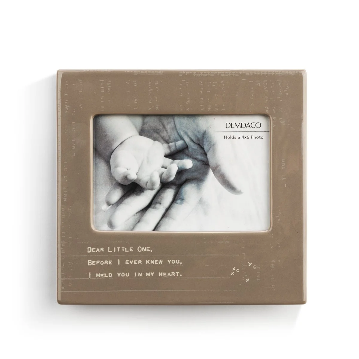
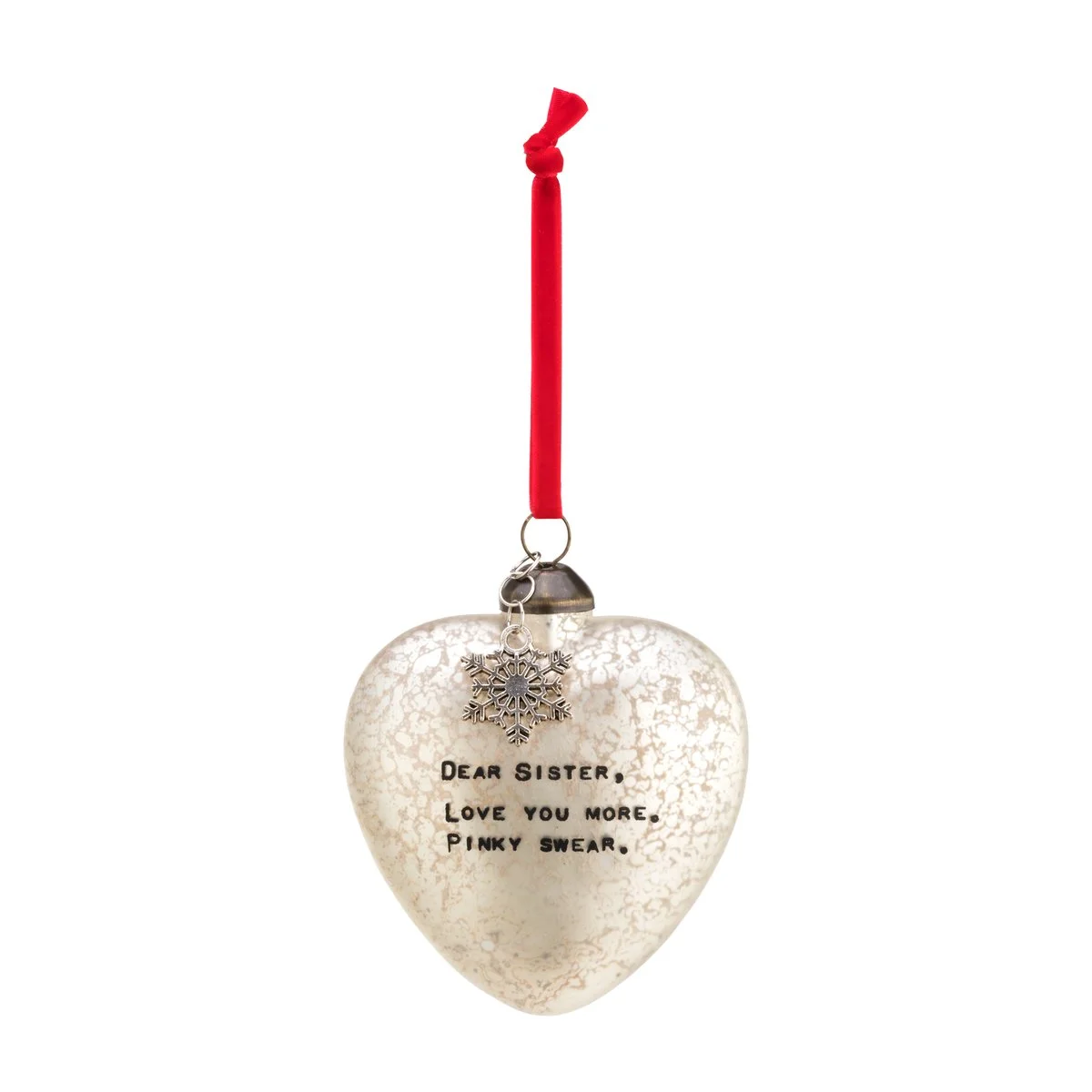
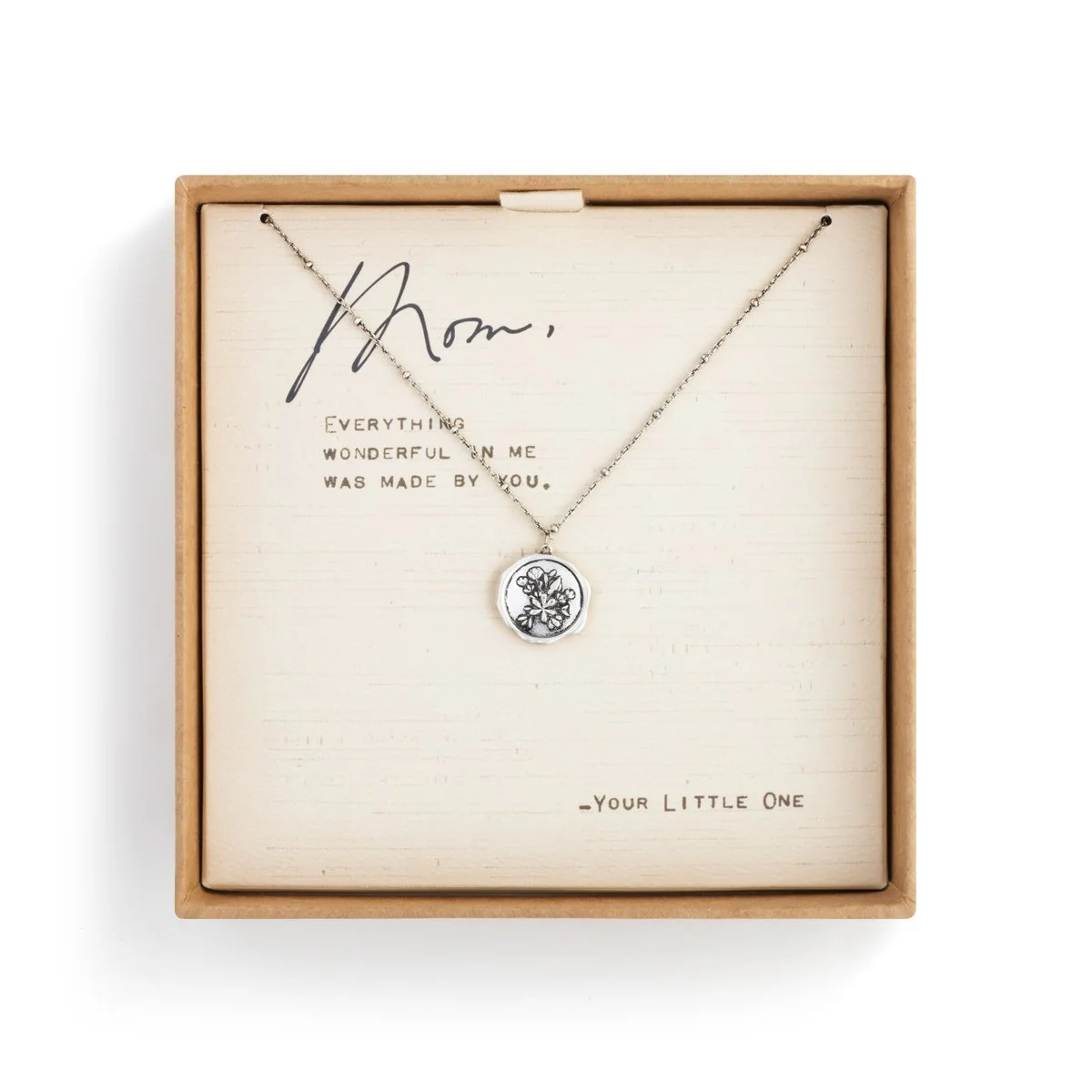
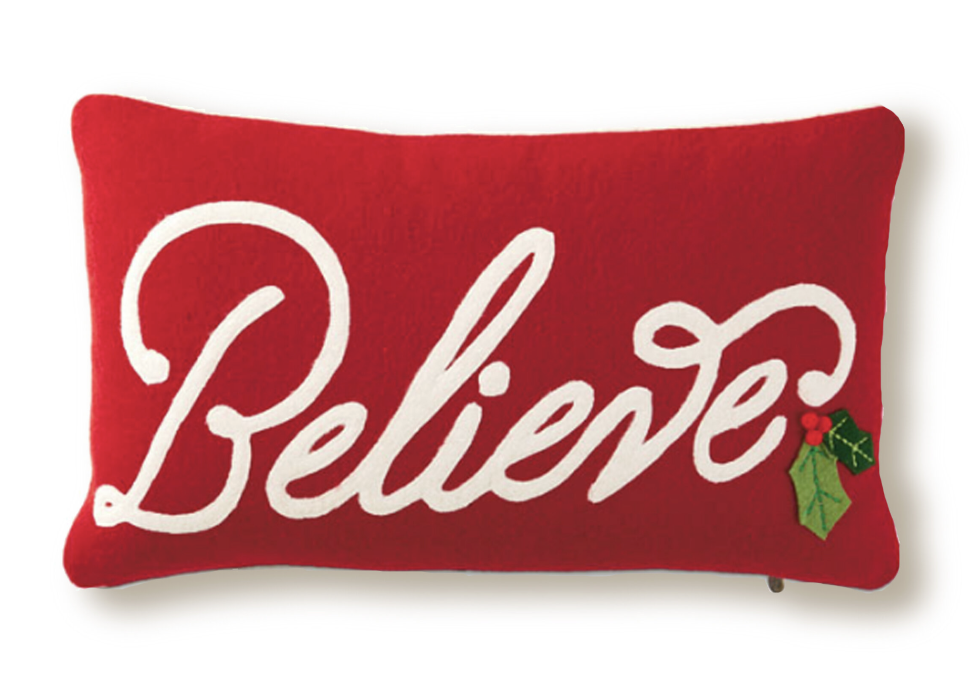
In an era of rapid communication, do we even write letters anymore? The human experience or writing something personal, emotional, heartfelt. It is a craft. Not everyone can express themselves so openingly and beautifully. Sometimes you just need help in what to say.
I wanted to create a line that captured that essence and was a nod to simpler days. The art is loosely based on the lost art of letter writing. Each item was either hand lettered, or combination with using my father’s old typewriters. The personal, hand-crafted feel compliments the relationship-based messages.
This was the first caption driven line for DEMDACO. The first year sold over $1M dollars and the key items remained strong for 5 years.
© DEMDACO
Hallmark has had a long standing relationship with Dutch artist, Marjolein Bastin. Dating back to the mid 1980s her art has appeared on Hallmark’s greetings, giftware and gift products. Gift sales declined over time and Hallmark did not pursue a product assortment for about 10 years. In 2018, I encouraged Marjolein to do a collab with Hallmark Artist, Kim Pjecha. I art directed fresh patterns and crashed them with gentle nature observations of Bastin’s work. The fresh compositions were a success during our Easter and Mother’s Day selling window.
With each gift line, I travelled overseas to ensure the product was produced to the design standards. Marjolein Bastin’s art poses significant challenges due to the soft watercolor style, and this was the focus of my travel for this particular assortment. I met with the ceramics and decal manufacturers ahead of time to talk about the nature of Bastin’s work and the details we needed to hold. We came to an agreed solution prior to designing the product, resulting in a faster sampling time.
© Hallmark Licensing, Inc.
© Marjolein Bastin
Holiday is Hallmark’s largest gift season. The caring connector is looking for gifts and decor items that will help them build, grown and deepen their relationships. “Live Merry” was the mantra for the season as she sees herself as the “merry maker” who provides a home filled with joy and laughter for her family and friends. She becomes a bit nostalgic at the holidays, taking on a more classic aesthetic and harken to a more simple time where it is less about tech and more about moments. Her spending is managed, so when looking for herself during the season of giving, she is only looking for one or two items that will bring freshness to her home. She wants the items to feel special, the texure of a wax resist lettering, boucle embroidered tea towels, or the embellishments of a figural santa do not go unnoticed, this is why she is shopping at the Hallmark Gold Crown store versus a mass market retailer, great price/value.
Retailers are thinking in the same manner. Looking for micro collections that can signify the holiday season, they will tuck them into their everyday gifts to draw consumers around their store and make it seasonal without a high markdown liability.
I art directed the broad story for 2018 with licensed property, Peanuts and Hallmark’s beloved artist, Artist Geoff Greenleaf. Geoff’s work was the basis for The Hallmark Channel’s “Christmas in Evergreen” movie, set in the idyllic town of Evergreen, VT. The gift assortment carries the same classic, nostalgic feel of the movies but with a twist in theme and design.
The caring connector prefers to set her holiday decor right after Thanksgiving and leave it up through February. The assortment of gift products that met the need of our traditional consumer. Snowmen are a key icon because of its ability to live all winter long. The assortment was built around Geoff’s snowmen collection.
© Hallmark Licensing, Inc.
Not surprisingly, birthday is approximately 70% of the greetings sales in the Hallmark Gold Crown Stores. It makes sense to also have a line of gift products that encourage the caring connector to add to their guest check.
The birthday assortment leans heavily into the optimistic trend. It was important to create a happy vibe. Working with lettering and illustration designers, we created an assortment with playful type, trend right editorial/graphics, and color palette. Items like the oversized “Birthday Vibes” mug and “It’s My Day” wine glass are humorous and make a great gift. Rainbows and 80s style icons continue to trend and it was important to incorporate them into the overall palette.
Milestones are key to Hallmark’s birthday assortment. Captions like 21, 40, 50 and even 100 are what she is looking for when she is attending milestone parties.
© Hallmark Licensing, Inc.